Today, the entire world consumes massive amount of data and give out zeta bytes of data. As a Data Scientist one must be proficient with Data Analytics, Statistics, Programming and Machine Learning.
Data Analytics contributes the major part to Data Science.
Few of the Key goals in Data Analytics:
To gather and compile data.
Find a pattern in the data.
Perform DDL, DML on the dataset.
Analyze data and perform Prescriptive, Descriptive analytics
Visualize the data
As a beginner, you do not have to learn Python or R or any other programming language to perform Data Analytics.
We can use Microsoft Excel built in tools to Cleanse, Analyze the data and make it readable to a Data Scientist.
How to Perform Data Analysis from Excel
Steps for Data Analysis in Microsoft Excel:
Open Excel and create a Table with required dataset for Data Analysis. In this case we are going to use the stock market share price of a particular stock.
We have a sample data in the form of a Table, once the data is pasted on to the excel. Select the entire dataset you would like to analyze and prese CTRL+T. Which will turn the data into a Table format.

To perform Data Analysis on the Open Price of the stock price, select the column Open Price from row 2 to end of the rows.


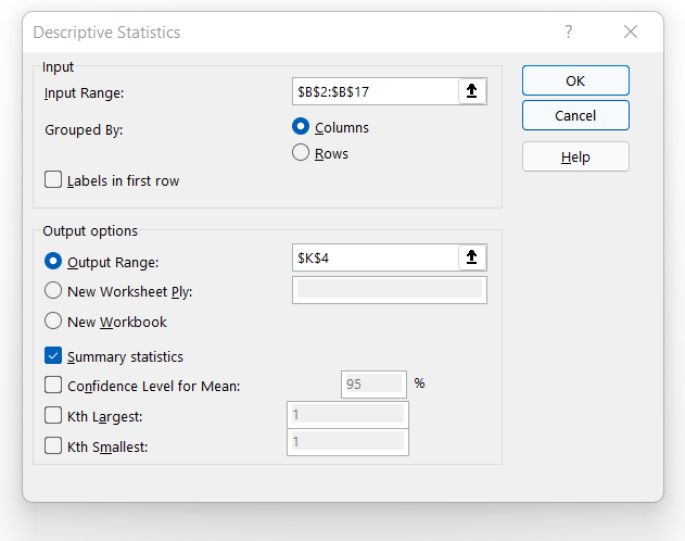
Select the 'Descriptive Statistics' and click Ok

Select the Open Price Column from row 2 in 'Input Range'
Select desired Cell in the spreadsheet for the "Output Range'. (Here K4)
Ensure the 'Summary Statistics' check box is enabled.

Following Output is displayed on K4 Cell.

Like wise we perform the 'Pareto Analysis' on the Close Price.
Select a Bin (bucket as multiple of 40 from 1080 - 1200) in column i4.

Select Column C (C2: C17) and select 'Data Analysis'.

Select the Input Range as Close Price
Bin Range as Bin Range. (I4:I7)
Output Range as K3 in the same spreadsheet.
Ensure 'Pareto Sorted Histogram' and 'Chart Output' is enabled.

Click on Ok and you will be able to see the Histogram on Close Price.

Now if you would like to know the relation with Open Price and the Close price of stock, we can you the Co-relation function from Excel.
Select the 'Open Price' column and 'Close Price' column and go to Data Analysis and click on Co-relation.

Select the Input Range as Open Price and Close Price and ensure to enable the check box on 'Labels in first row'.

You will get the below result in the cell specified in the output range.

You will also get a same result if excel function 'CORREL' is used as below.
=CORREL(Table2[[OPEN PRICE ]],Table2[[CLOSE PRICE ]])
Similarly, we have several other Statistically Analysis tools in-built present in Excel.
Data Analysis is more about following a few logical steps with mathematical concepts and statistical algorithms.
Comments